DCPA NEWS CENTER
Enjoy the best stories and perspectives from the theatre world today.
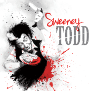
Kyle Malone started with the Denver Center for the Performing Arts as a graphic designer in 1999 and became Design Director in 2018. As part of his role, he has been creating the artwork for the Denver Center Theatre Company for 12 seasons. He recently revealed the 2025/26 season artwork and shared what goes into the process of distilling pages and pages of scripts into eight signature images.
It is crucial to build brand recognition for the Denver Center Theatre Company through fostering customer trust, establishing a strong reputation, and providing a powerful theatrical experience.
“We want our artwork out in the community to reflect the world-class work on our stages. We want the public to see a piece of art and instantly connect it to the Denver Center Theatre Company.” — Kyle Malone, DCPA Design Director


The art should stand out across various mediums. Current and potential patrons are surrounded by tons of competing images, so the Theatre Company art needs to have stopping power.
“We want to have art that is unique and different so that it stands out among the 5,000-10,000 images we are served up each day.”
The art is the first impression audiences have with the show. It is important it aligns with the theatre experience.
“We start the season artwork months before a show has been cast, a set has been designed, and photography is available. We work off the vision of the show to set the right tone, energy, and representation of what patrons will see on stage.”

Over the years, the in-house DCPA graphic design team has established a style for the Theatre Company that is emotional, modern, raw, and unique.
“We don’t want to go too far into the narrative. We want to evoke the emotion that is in line with the story itself.”


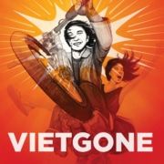

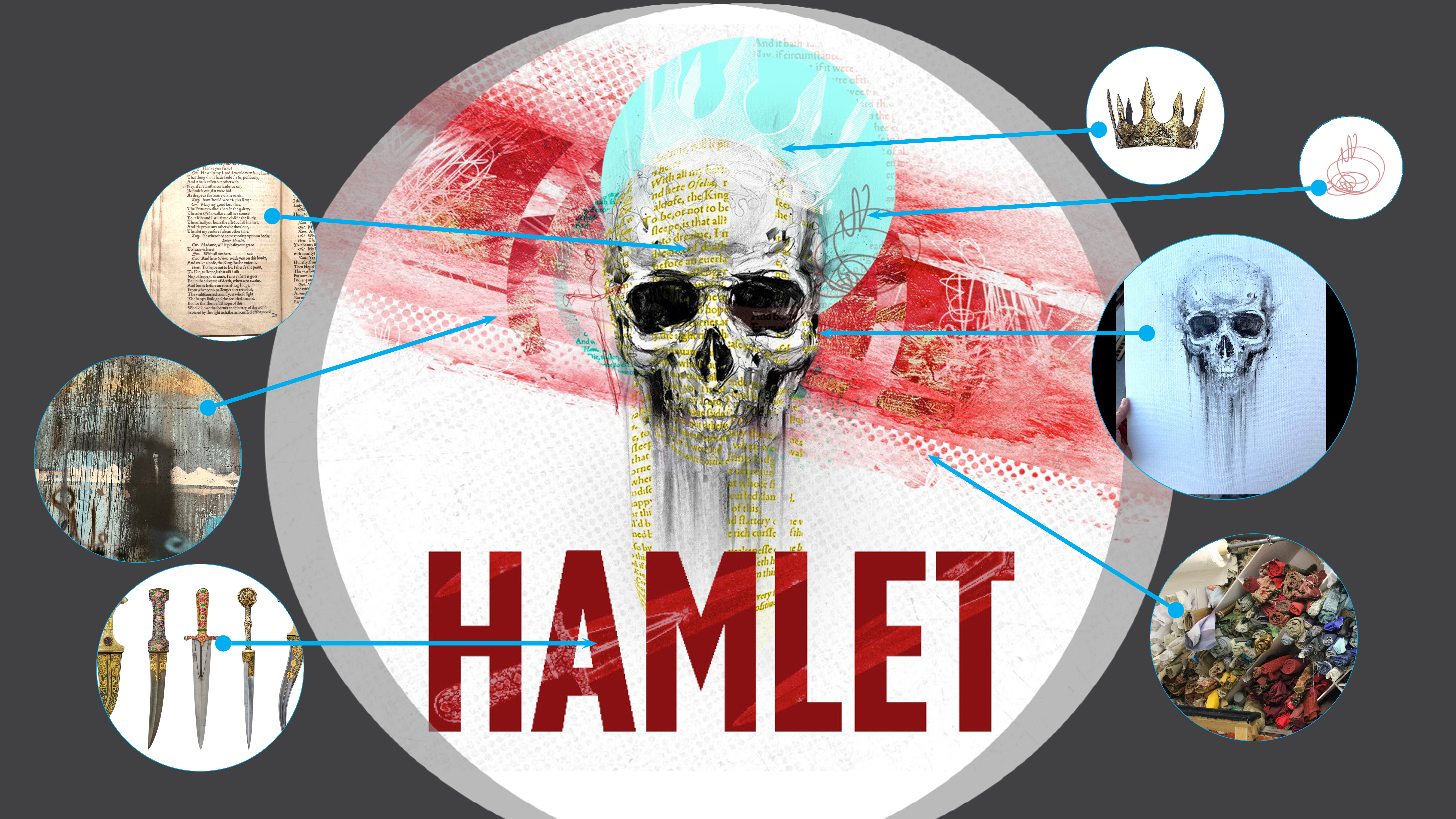
It’s important to find things that essentially true to the story using illustrations, photographs, textures, and references to the play to help further tell the story.
“I want to represent the Theatre Company in our artwork, so textures play an important role. I take photos of our fabrics, our paint shop, our prop elements. While the general public won’t notice these small touches, it injects a little of us into the artwork.”
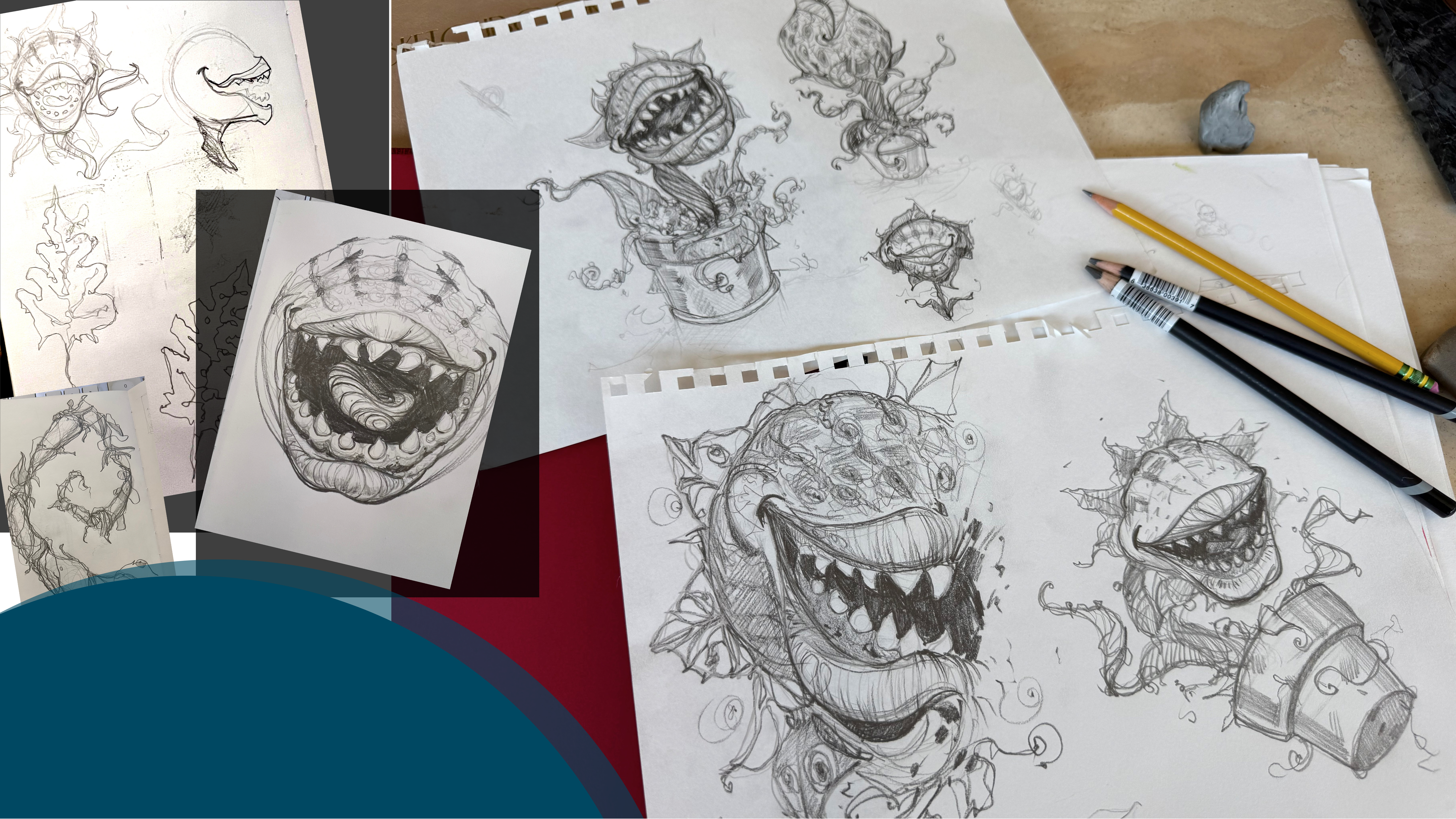
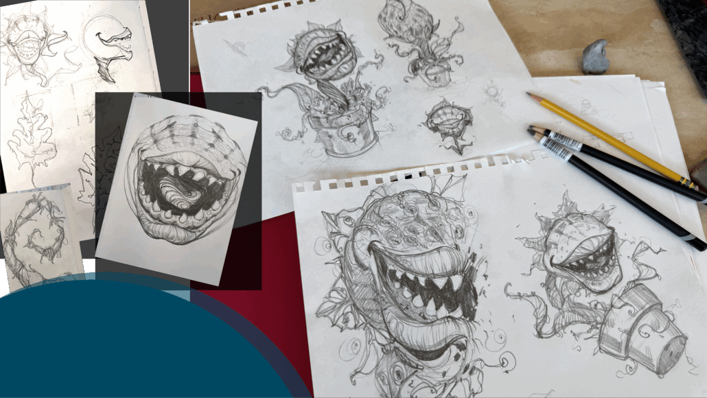
The development of the artwork requires:
“The design is a single frame depicting a live theatrical experience, so it should feel rough and alive.”
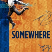
After following the creative process, we’re pleased to share the artwork for our 2025/26 Denver Center Theatre Company season.


 ©Denver Center for the Performing Arts


