DCPA NEWS CENTER
Enjoy the best stories and perspectives from the theatre world today.
Enjoy the best stories and perspectives from the theatre world today.
This article is reprinted with permission from Les Misérables. Written by Set & Image Designer Matt Kinley.

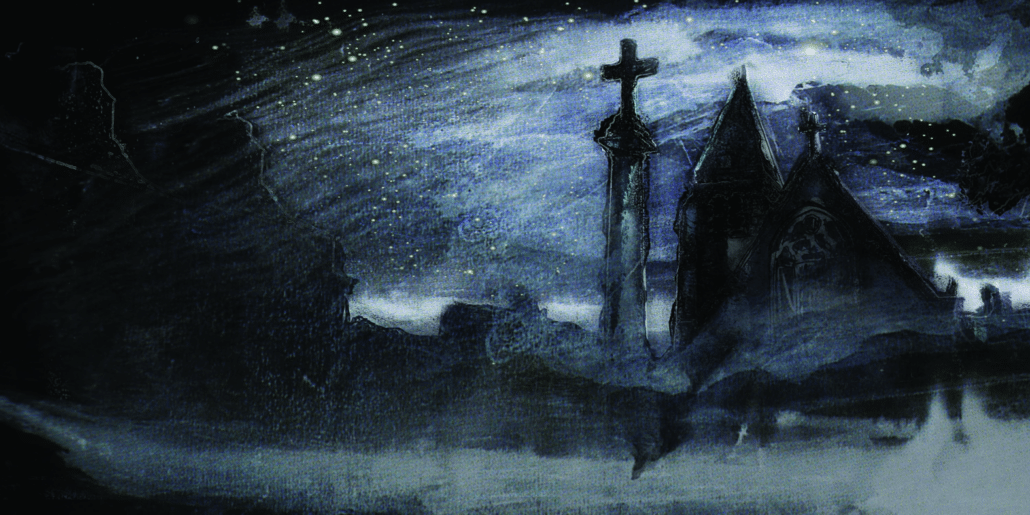
Church Set Drop – Matt Kinley & Victor Hugo
I had already worked on several original productions of Les Misérables for John Napier when I was asked by producer Cameron Mackintosh to start looking at other ideas for a tour of Les Misérables. Having been involved in the successful adaptations of My Fair Lady and Mary Poppins for touring, I thought the task would be simple; in my mind it wouldn’t be too hard to scale down the behemoth that I perceived Les Mis to be – I was wrong.
John’s original set is undoubtedly one of the masterpieces of 20th-century theatre design, and despite its physical size it is impregnable in its ingenious simplicity. This sparseness meant that every time I started coming up with ideas, they would invariably just make the show more complicated. In the end, I had to take it on the chin and admit that nothing could ever be as simple, and just enjoy the journey in taking it in a new direction.
The angle I wanted to explore was releasing the design from the black box it had been in with colour and light, as the one thing the original show doesn’t quite communicate to me is any sense of time or place.
As there were so many scenes in this epic piece, I knew I wanted to work with projection in order to locate the action, but to be used very simply, almost more like old-fashioned slides or rostrum work as this was a show whose story was so complex it didn’t justify constant animation apart from some key scenes; the question was: what to project? I had been vaguely aware that Victor Hugo was a painter as well as a writer, but nothing quite prepared me for the images that I came across when researching the show. Hugo was obviously a visionary; the drawings I found were at once both abstract, fantastical, and free but underlined with a backbone of draftsmanship. Hugo, as an artist, was well ahead of his time. There are many examples in amongst the 4,000 or so works that demonstrate his experiments with different media and processes; from charcoal, sepia, pen, ink and soot to lace prints, folded paper with ink (similar to Rorschach tests) as well as straight responses to either landscape, figure, or the subconscious.
The one unifying feature throughout his whole body of work is the sombre, yet beautiful, mainly sepia color palette, and especially his use of chiaroscuro – using the contrast of dark and light to add both body and form as well as atmosphere to the work. This brooding blackness and light also seemed the perfect embodiment of so many characters and storylines within the show.
It was for this reason that I started to employ the use of these paintings in the projections as they were so dark and rich I thought they would live well within the original aesthetic of the show. Many of the projections were produced using a blend of his paintings and drawings, sometimes combined with 19th-century French photography to ground and locate them, combined with painted cloths which are more directly based on his abstract and landscape work.
Hugo kept his paintings and drawings away from public exhibit for fear they might detract from his writing. Delacroix expressed the opinion that, if Hugo had decided to become a painter instead of a writer, he would have outshone the artists of their century. Indeed, there are many paintings that would not have looked out of place within the works of the credited abstract expressionists and surrealists in the following century. I hope that this production can go some way to reconciling these two aspects of this artist with each other, as to me they seem to have a perfect symmetry.
DETAILS
Les Misérables
May 10-21, 2023 • Buell Theatre
Tickets
